1. In what ways does your media product, develop or challenge forms and conventions of real media products?
Pre-production- Exploring short films and looking into what conventions make a good short film
One of our research and planning tasks was to find 3 or more short films and analyse them using MRANG
- Media language
- Representation
- Audience
- Narrative
- Genre
After analysing my 3 chosen short films I could see the typical conventions and what makes a short film, for example:
- 3-15 minutes long.
- Usually stick to 2-3 main characters as they don't have enough time to go into depth.
- plot twists, short films have bigger plot twist to make it more interesting.
- They stick to 1-3 locations as they have a low budget.
- Todorov's theory can usually apply to short films.
- They are published by independent companies.
- They represent social realism and its usually part of their genre.
- The actors are never big or famous names as they are to expensive for a low budget film.
- One protagonist and sometimes a couple antagonists
On the brink
Our film challenges the forms and conventions of short films, for example the end of our film ends as a cliff hanger so the audience don't know whether the main characters jumps off the cliff or not. This challenges conventions because many short films resolve the problem at the end unless they are making a second film because the audience are watching a short film to find out the story faster.
Other ways we've challenged conventions:
Other ways we've challenged conventions:
- We used 4 different locations during our shoot, we did this to show that the characters were looking for the protagonist.
- Used underwater shots- many short films don't have the budget for types of technology that would allow them to shoot underwater.
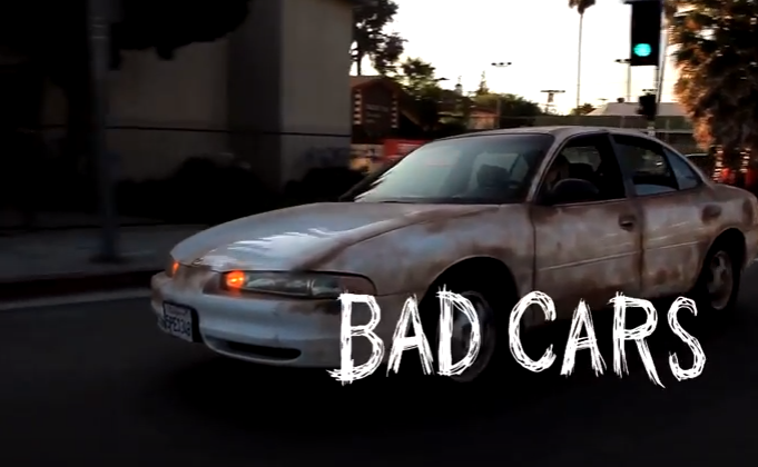
- The film is targeted at 16-25 however the main character is older than this as are some of the other cast member. Some short films use characters the same age as their target audience for example 'bad cars'.
- 6 cast members.
- Two main protagonists rather than one.
Conventions we followed:
- Real life issue (drug use,mental health)
- The length of the film
- Chronological order.
- Voice over to read out a private letter as if it were the person there reading it.
- male characters (its common in films for males to be the character facing the issues rather than a women)
- Todorovs theory applies.
Short film 1
Unleaded is a short film produced by Luke Davies, 'unleaded' is about '3 thugs in south London attempt to rob a petrol station but are suddenly interrupted when a couple of stoner's come in with a serious case of the munchies.'
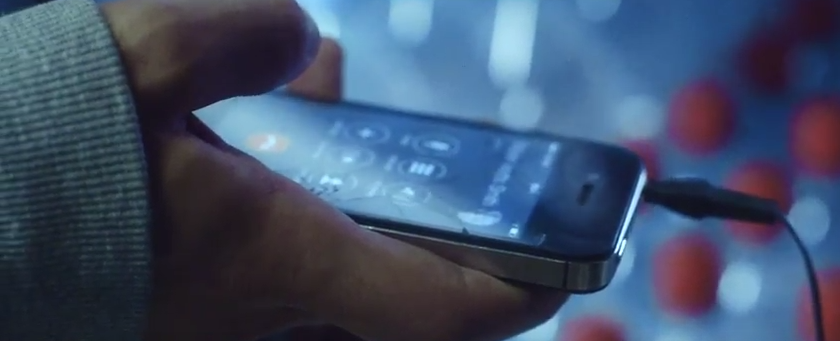
When the film begins the screen is black however we can hear diegetic sounds of cars driving past, this creates enigma in the audience as we wonder where the noise is coming from and what it is. we can also hear banging sounds and the sound of petrol going into a car tank, this would make sense as the dark comedy is called 'unleaded'. the first moving image we see is a dial on the petrol tank that tells us how much we are putting in and how much it will cost. as this is the establishing shot it suggests that the dial is significant to the story line. could this dial be important in suggesting that the people in the car are going to be driving far away? running away?
the title also creates enigma because it doesn't tell us much and doesn't hold an important meaning in society other than it makes our cars drive.
Firstly we are introduced to a female wearing a grey hoodie with the hood up her body language and facial expression suggest that she is upset/uncomfortable i can denote this because the characters eyes are red and full of water suggesting she is about to or has been crying. in an extreme close up of the rear view mirror we can see the characters eyes darting around as if she is worried and looking for someone or something?
the setting is quiet apart from the sounds of cars which suggests its set at late night or the petrol station is in a remote area.
There is a cutaway from the female protagonist looking at 3 men robbing the petrol station, This creates enigma as we wonder why the protagonist isn't doing anything about the situation. initially the audience believed that the female had relations with the robbers and was waiting for them to get out to drive off. however the protagonists body language and facial expression would suggest she is worried and isn't sure what to do.
The props used suggest that the robbers went with the intent to kill or threaten, This isn't made clear to us until there is a long shot of the 3 men and one holding a gun against the man on the till. the prop represents gang culture in London and the use of guns is more common. the males costumes also represent gang lifestyle, They are wearing dark clothes and hoodie's which suggest they are hiding themselves.
Later on in the film the 'stoners' arrive in there car, the car is full of items squishing the protagonist in the back of the car. the mise en scene suggests that the 3 characters in the car have no organisation in there life perhaps they don't have a house to lives in? the 'stoners' have red lined eyes that suggest they have been doing a lot of weed. this also has representations of gang culture in London where the use of drugs is common.
The camera pan across from the number plate of the 'stoners' cars this is a focused shot that suggests the number plate is important. we also see the headlights turn off slowly this gives the audience a creepy feel and creates enigma as we wonder why the number plate is shown and what is it symbolising. we then see another close up of the female protagonist looking very worried as she isn't aware that the car isn't anything to do with the robbery.
In the car the 'stoners' appear to be having an argument about who should go into the petrol station to cure their munchies. there is a p.o.v from the characters in the front of the car therefore we can only see the protagonist arguing, it seems that the protagonist is arguing with himself because we don't see the other too. this could be intentional to show that he is high. The male protagonists accent and dialect suggest he is from a lower class background or from poorer parts in London.
The main protagonist in the 'stoners' car walks into the shop and surprises the gun man this is in a long shot cutaway and mid shots that show the gun mans confusion. there is an over the shoulder shot of behind the gun man looking at the 'stoner' the costume of the stoner is hiding his identity from the gunman. (he cant see that he has headphones in) therefore getting angrier and angrier. the 'stoner' stands still staring at the magazines, completely unaware of the threat he is under. the 'stoners' represent some typical teenage behaviour such as being disconnected and unaware of society as they have headphones in.
Anger is shown through the use of language, all of the characters use swear words in conversation and to express their emotion, this could be used to represent and attract younger audiences of a certain background. further in to the gunman scene the 'stoner' is still unaware of the gunman holding the gun to the back of his head. in this scene we are introduced to the dark comedy in the film this is shown through the phone call, However this time the gunman is unaware of it. The comedy is shown through the diegetic dialogue with the 'stoner' and and his friends, as he speaks to them on the phone the gunman shouts at him and then the 'stoner' replies to his friends however it appears that he is shouting back at the gunman this antagonises the gunman. this is all shot it a shot reverse shot to show both characters body language and facial expression, as this is a shot reverse shot there is lots of cuts which suggest a fast pace and intense atmosphere.
In the last scene the women at the beginning walk through the door, there is diegetic sounds of a bell on the door as it opens. the gunman turns around quickly and shoots the women before he had a chance to see who he shot. we can hear a non diegetic high pitch screech that suggests panic and can symbolise when someone is dieing or passing out. all other diegetic and non diegetic sounds disappear. this gives the audience the feeling of being surreal. this is also a shot reverse shot of the gunman then the women, we see a mid shot of the female holding herself where she was shot. her body language and facial expression show shock and worry, as do the gunman's!
The genre of 'unleaded' is dark comedy i believe this would appeal to an audience of 17-20 men because some may relate to parts of the plot or just find dark humour funny. i don't think this film was made to target women of any age due to the mise en scene and the storyline. stereotypically women don't like aggression, bad language or dark humour in films. men would find this more interesting.
in 'unleaded' Todorovs theory can only be applied to some of the film, such as the beginning there isn't really an equilibrium due to the sense of enigma we get from the mise en scene and the typical iconography. however from the tiny bit of peace at the beginning we are thrown into the disruption (the robbing beginning). we can then apply the recognition stage of Tvetzan Todorovs theory when the women protagonist is shown looking worried and disturbed be the men. however there isn't an attempt the repair the disruption, we then have another equilibrium at the end when women gets shot, the gunman's attempt to repair the disruption is to run off.
Short film 2

 |
| Title sequence |
When the film begins the screen is black however we can hear diegetic sounds of cars driving past, this creates enigma in the audience as we wonder where the noise is coming from and what it is. we can also hear banging sounds and the sound of petrol going into a car tank, this would make sense as the dark comedy is called 'unleaded'. the first moving image we see is a dial on the petrol tank that tells us how much we are putting in and how much it will cost. as this is the establishing shot it suggests that the dial is significant to the story line. could this dial be important in suggesting that the people in the car are going to be driving far away? running away?
the title also creates enigma because it doesn't tell us much and doesn't hold an important meaning in society other than it makes our cars drive.
 |
| Petrol station: Close up shot |
Firstly we are introduced to a female wearing a grey hoodie with the hood up her body language and facial expression suggest that she is upset/uncomfortable i can denote this because the characters eyes are red and full of water suggesting she is about to or has been crying. in an extreme close up of the rear view mirror we can see the characters eyes darting around as if she is worried and looking for someone or something?
the setting is quiet apart from the sounds of cars which suggests its set at late night or the petrol station is in a remote area.
 |
| Female protagonist |
There is a cutaway from the female protagonist looking at 3 men robbing the petrol station, This creates enigma as we wonder why the protagonist isn't doing anything about the situation. initially the audience believed that the female had relations with the robbers and was waiting for them to get out to drive off. however the protagonists body language and facial expression would suggest she is worried and isn't sure what to do.
 |
| Gun scene |
The props used suggest that the robbers went with the intent to kill or threaten, This isn't made clear to us until there is a long shot of the 3 men and one holding a gun against the man on the till. the prop represents gang culture in London and the use of guns is more common. the males costumes also represent gang lifestyle, They are wearing dark clothes and hoodie's which suggest they are hiding themselves.
Later on in the film the 'stoners' arrive in there car, the car is full of items squishing the protagonist in the back of the car. the mise en scene suggests that the 3 characters in the car have no organisation in there life perhaps they don't have a house to lives in? the 'stoners' have red lined eyes that suggest they have been doing a lot of weed. this also has representations of gang culture in London where the use of drugs is common.
 |
| 'Stoners' car |
The camera pan across from the number plate of the 'stoners' cars this is a focused shot that suggests the number plate is important. we also see the headlights turn off slowly this gives the audience a creepy feel and creates enigma as we wonder why the number plate is shown and what is it symbolising. we then see another close up of the female protagonist looking very worried as she isn't aware that the car isn't anything to do with the robbery.
 |
| 'Stoners' close up shot of number plate |
In the car the 'stoners' appear to be having an argument about who should go into the petrol station to cure their munchies. there is a p.o.v from the characters in the front of the car therefore we can only see the protagonist arguing, it seems that the protagonist is arguing with himself because we don't see the other too. this could be intentional to show that he is high. The male protagonists accent and dialect suggest he is from a lower class background or from poorer parts in London.
 |
| Close up of the 'stoner' |
The main protagonist in the 'stoners' car walks into the shop and surprises the gun man this is in a long shot cutaway and mid shots that show the gun mans confusion. there is an over the shoulder shot of behind the gun man looking at the 'stoner' the costume of the stoner is hiding his identity from the gunman. (he cant see that he has headphones in) therefore getting angrier and angrier. the 'stoner' stands still staring at the magazines, completely unaware of the threat he is under. the 'stoners' represent some typical teenage behaviour such as being disconnected and unaware of society as they have headphones in.
 |
| Gunman's confusion inn close-up |
Anger is shown through the use of language, all of the characters use swear words in conversation and to express their emotion, this could be used to represent and attract younger audiences of a certain background. further in to the gunman scene the 'stoner' is still unaware of the gunman holding the gun to the back of his head. in this scene we are introduced to the dark comedy in the film this is shown through the phone call, However this time the gunman is unaware of it. The comedy is shown through the diegetic dialogue with the 'stoner' and and his friends, as he speaks to them on the phone the gunman shouts at him and then the 'stoner' replies to his friends however it appears that he is shouting back at the gunman this antagonises the gunman. this is all shot it a shot reverse shot to show both characters body language and facial expression, as this is a shot reverse shot there is lots of cuts which suggest a fast pace and intense atmosphere.
 |
| Over shoulder shot |
 |
| 'Stoner' unaware of the danger behind. reversed over shoulder shot |
In the last scene the women at the beginning walk through the door, there is diegetic sounds of a bell on the door as it opens. the gunman turns around quickly and shoots the women before he had a chance to see who he shot. we can hear a non diegetic high pitch screech that suggests panic and can symbolise when someone is dieing or passing out. all other diegetic and non diegetic sounds disappear. this gives the audience the feeling of being surreal. this is also a shot reverse shot of the gunman then the women, we see a mid shot of the female holding herself where she was shot. her body language and facial expression show shock and worry, as do the gunman's!
 |
| Phone call |
The genre of 'unleaded' is dark comedy i believe this would appeal to an audience of 17-20 men because some may relate to parts of the plot or just find dark humour funny. i don't think this film was made to target women of any age due to the mise en scene and the storyline. stereotypically women don't like aggression, bad language or dark humour in films. men would find this more interesting.
in 'unleaded' Todorovs theory can only be applied to some of the film, such as the beginning there isn't really an equilibrium due to the sense of enigma we get from the mise en scene and the typical iconography. however from the tiny bit of peace at the beginning we are thrown into the disruption (the robbing beginning). we can then apply the recognition stage of Tvetzan Todorovs theory when the women protagonist is shown looking worried and disturbed be the men. however there isn't an attempt the repair the disruption, we then have another equilibrium at the end when women gets shot, the gunman's attempt to repair the disruption is to run off.
Short film 2
Bad cars
 |
| Title sequence |
I found Bad cars on the short of the week in the comedy section. Bad cars is about a man and women that both have very old and broken cars struggling to successfully date in LA. Bad cars was produced and directed by Anthony Deptula in 2010.
The first character we are introduced is the female protagonist, we see an extreme close up of her eyes looking in the rear-view mirror, one of the props used is a pair of thick rimmed glasses are stereotypically a symbol of smart or working women. In this shot we can hear diegetic sounds of cars driving and beeping their horns, this suggests it is set somewhere busy and urban. The title and first scene would suggest the beeping is aimed at her because she has a 'bad car'. The female’s body language and facial expression would imply that she is stressed. There is binary opposition between the female protagonist that has an old broken car that can’t go fast compared to a new mini that isn’t broken and can go fast! Already I can connote that the film could be about a student life, maybe she has just started a life in LA so doesn’t have much money to buy new cars like the rest of LA.
 |
| extreme close up in rear-view mirror |
 |
| Broken car |
We are introduced to another male character in an extreme close up and cut in of his hands, starting up an old and broken car. The audience can start to pair the characters together as we are firstly shown women driving a broken car and then a man trying to start a broken car, this foreshadows that they will have relations with each other later on in the narrative. The narrative is linear we can denote this because the narrative begins in chronological order and shows a form of progression.
 |
| Male struggling to start up his car |
In a mid-shot of the female we see her doing her hair with a hairdryer, the protagonist is also her car very messy and full of props that suggest she has a busy life. As she is doing her hair in the car it would suggest she hasn't got much time and is in a rush, to get to a date?
 |
| Mid shot getting ready in the car |
There is a long shot of the male protagonist running like he’s in a rush, we then see a two shot of both characters meeting on a corner (their arranged place to meet for their date) this scene is also shows the genre (comedy) because we were shown both characters journey to the meeting place, and they both parked far away on opposite streets so the other wouldn't see their broken and old cars!
 |
| First time meeting Their costumes are both very bright and colourful; however in the long shot of them meeting, their costumes were almost binary opposites! The male has a bright pink shirt on and the female has a mint green dress on. The choice of costume creates the sense of a mismatched relationship. in this scene there are a few awkward yet funny events that occur on their date, first being the awkward first meet, then we see a montage of events edited in after production. Another event was shot in a long shot showing both characters standing against the wall eating pizza. This is an odd first date activity to be eating pizza by the side of the road on a first done, this is another way the comedy is shown through mise en scene. The female then drops her pizza on the floor, looking a little embarrassed so the male protagonist drops his to. Throughout the short film, there is a non-diegetic song as the soundtrack. The soundtrack is very upbeat and happy that suggests that the two characters are happy, however even though their date isn’t society’s norm they are still enjoying themselves. There are a number of different funny events that occur on their date. They go to the library however once again they don’t follow society’s norms and walk around with books on their heads! All these events give a sense of happiness and light-hearted kind of lifestyle to the audience and take us out of everyday life and make us laugh! |
 |
| Dropping food |

At the end of their date we see a mid-shot/two shot of the two characters sitting outside a dance class, trying to avoid going in each others cars or going to one another’s house. This begins to get awkward for the pair as they realise they don’t have any other option than to take the bus to the beach.
In the mid shot the characters facial expression look funny/awkward as the female biting lip and the male looks down in shame.
 |
| Awkward realisation |
The two characters are shown is a mid-shot from behind them sitting on the beach bench, the setting is dirty. The props around make the set look messy and dirty; there is also underwear on the bench behind them. This suggests that the setting is a city by the sea however the area doesn’t appear to be looked after. Props suggest that the area may be used mostly by teens that may not care about the environment or by busy business workers that don’t have the time to take care of their surroundings.
 |
| Beach scene long shot |
At the end of 'bad cars' both characters decide to go their separate ways after trying to sort the failed date out! After this as the audience we assume that it’s the end for the characters. However driving home the female protagonist breaks suddenly and a car goes into the back of her car, in a mid/long shot through her rear-view mirror we can see the male protagonist awkwardly waving at her.
 |
| Car crash |
The target audience is 18-, 25 years old that are living the student life or just starting up their careers. The target audience is implied through the use of costume, hair and makeup, props and the setting/decor this is all arranged to suggest the characters haven’t got a lot of time or money or organisational skills!
Todorov's theory could be applied to 'bad cars' however it is like 'unleaded' in the way that the narrative hasn’t got set equilibrium's and disruptions that the couple have to overcome. You could argue that the narrative isn’t linear therefore todorov's theory can only be applied to some of the film. Todorovs theory would say that at the beginning there would be peace, however in 'bad cars' the beginning is hectic for both characters trying to get to the date on time. There are a number of disruptions that the realisation stage then occurs. There is then some restored order before the couple both realise that they haven’t got much to do because of their broken cars. There is then a new equilibrium or you could say the first equilibrium where the couple decide to get the bus and all is well till they get to the beach.
 |
| Todorovs theory |
9 frame analysis: on the brink


Frame 1:
The opening shot of our film is a blurry worms eye view shot of the sky, we introduce our production logo in this shot as well. the camera then fades to the front door of the house which we assume is a family home. we then hear diegetic sounds of footsteps walking towards the door, then our title appear in front of the door. the camera cuts to an eye level shot of two new characters we assume from the warm welcome that they are family. both the characters have a happy facial expression and appear to be happy. we then enter the house following the protagonists where the daughters boyfriends get introduced to other family members. The scene is set in daylight/evening creating a soft lighting that gives a sense of being calm.
Frame 2

In this frame we show the family chatting and having general conversation, the family and audience are both unaware of the fathers emotions. we use camera panning in medium shots to show the whole family together, this creates the feeling that John is happy and has a caring family around him, however even though he does it doesnt help his depression.
The lighting is warm in this shot and there is quiet music in the background making out for a family night in. However compared to the rest of the characters John appears to be feeling awkward or down and uninterested. The happy atmosphere shown in mid to close ups contradicts what john is really feeling. John disrupts the 'happy family' by excusing himself from the table however the family are unaware of his worrying thoughts.
Frame 3

In this scene the audience are introduced to the social realism in our film and the issues that John is facing, we see a mid over the shoulder shot of John looking in the mirror. His facial expression suggests that he is worried and stressed. He then picks up a pot of tablets, the orange pot is iconography of drugs. The rest of the family are unaware of the fathers struggles and carry on there evening we show this through a parallel cut and graphic match. This shows the difference between the daughter that is happy and is about to give good news then shows the dad looking sad and contemplating life. We show an underwater shot using the go pro of john washing his face, this shot is distorted and creates a sense of curiousity and suspense in the audience as there is happy music playing in the background yet the male looks unhappy.
Frame 4:

In this shot of the volume of the non diegetic contrapuntel music raises suggesting that the suspense and tension is rising as the family start to worry and realise that the father is missing. Throughout this scene the shots are blurry and create a distorted effect. The parallel cuts show the different representations of mood and emphasise the fact that John should be having fun with his family and celebrating the daughters news but hes not. This is the disruption of the narrative according to todorovs theory as John begins a downward spiral.
Frame 5:

Frame 5:

This is the morning scene where the family panic and set a search for John as he hasnt returned home overnight. John is in an extreme long shot of him looking at the front of the church. the church signifies that John may be religious and this is a place he goes to think and contemplate. Johns body language and facial expression are different from last night, this morning he looks sad but not stressed this would suggest hes made his mind up. The setting is very calm outside and around john however in the house the family are the opposite. in this scene there is unrestricted narration the audience are more educated than the family as they know where the father is and the family dont. in this scene johns lonlliness is very clear, many sufferers of depression or a mental illness could relate to this and connect deeper with John.
Frame 6:
Frame 6:

In this scene there is a disruption for all the family members involved, the family at home are panicking and have realised this isn't normal for john. We used a p.o.v and shallow depth of field from rebeccas perspective showing the confusion and disorientation as her mum panickly shouts her name. the shot is also blurred this gives the effect that rebecca is just waking up and we are doing this with her and feeling the same emotions. Rebecca and alfies facial expression create a gripping moment for the audience as we can see the panic in their faces and the audience can imagine how scary it would be if it were to happen to them this is a shot where the audience can really connect with the characters. this is where the family try to repair and fix the disruption by sending each family member out to somewhere he may go.
Frame 7:

Frame 7:

When caitlin enters the church the non-diegetic music begins and sets the scene very sadily and suggests there is strong emotion. The music gives a feeling of being deeply sad just as a viewer as the soundtrack matches perfectly with the emotions in the film.There is a non-diegetic voice over of john reading the letter that caitlin is reading, we thought a voiceover of john would create more emotion as he has a shaky upset voice that will create more sadness and realism. Caitlins facial expression and body language show that shes getting upset and worried we show this through close ups and extreme close ups. a sorrowful guitar stresses the upset in johns voice and creates a heart wrenching scene that brings tears to the audiences eyes. Throughout the scene i think the soundtrack made it come together and it really does create strong emotion however many times you watch it.
Frame 8:

Frame 8:

We used a flashback to show the good times that rebecca had with her father, through these flashbacks Rebecca realises thats where her father will be as they spent many times there as a child. we use a dissolve transition to show the audience that rebecca is having a flashback, otherwise it would be confusing for the audience as there's no context been given. to create the shot of over beachy head cliff we used Nathans drone, this allowed us to get a very good setting shot that gives the audience a hint as to where he is and some context. The flashbacks create a happy feeling however when it ends the audience are pushes back into reality. As John reads the letter we use cuts to show the father getting closer and closer to the cliff edge, this creates a rushed and tense feel as we want Rebecca to find her dad before its too late.
Frame 9


In this scene we show John looking serious in an extreme close up, this shot is called breaking the fourth wall where John is looking straight through us. this shot is often used in dramatic or horror film moments as its so intense for the audience. We also used shallow depth of field to show that Johns isolated and not hearing the rest of the world anymore. we used a drone to show john on the cliff edge as it would be unsafe for us to be anywhere near the edge. This shot is where we see John really contemplating his decision and feel the tension and rush to stop him. In this scene we see John almost about to jump however in a tracking shot Rebecca finds him and run up the hill to him and to the audiences surprise shouts 'i'm pregnant' This shocks the audience as we hid this throughout the film to leave the audience on a cliff hanger. John turns his head but was it too late? This scene is what the audience has been waiting we have built a lot of tension and emotion which they want to be resolved however to have the most impact we decided to use a cliff hanger to create even more emotion and curiousity in the audience. There a loud diegetic sounds of winds that stop John from hearing her sooner, we cut fastly between the characters and show the distance between them, this creates suspense in the audience for that final moment its all built up.The non diegetic music also creates really strong emotions as the music gets louder and intensifes as the scene unravels.
Short film posters
Short film posters have typical codes and conventions that are used for all posters, designing my poster i made sure that i followed the conventions however i made it creative and feel it creates mystery as to what the film is actually about as it could have multiple interpretations. Here are some conventions:
- Laurel leaves- that show the awards the film has won, these are often from film festivals.
- Billing block- shows the people who were involved with the film.
- Companies logo
- Short reviews of the film
- star ratings
- Sponsors
- Background image from the film
- Bold title- A title that fits the film and catches peoples attention.
As part of our research and planning we had to research other short film posters so we understood the codes and conventions of them to help us create our own.
Short film poster 1
The Gravediggers son

Media language
Mise En Scene
Audience
Genre
The Gravediggers Son is an American short film written and directed by Jake Yard. The film has won a couple of American awards, Ouchy film festival, Los Angeles cine fest and Fest new film directors festival. Los Angeles film festival is a large and popular film festival that has alumini with celebrities such as Scarlett Johansson,Courteney Cox,Jessica Biel, Kirsten Dunst, Ralph Macchio, Ricky Gervais.
The Mise En Scene of the poster suggest that the film is a horror or thriller genre. The lighting is low key and very dark, this creates a scary feeling and a sense of danger. The male character is positioned in a long shot of him digging, the connotations of the prop (shovel) along with the other aspects of Mise En Scene are murder or a death? and the male is digging to hide or to find someone. The smoke around the character also creates a creepy feeling, is something beyond that? The title is positioned at the top of the poster and other information is at the bottom this allows us to focus on the image. The title gives more information than some short film posters. With this title I can connote that the film is about a man or boy, the title also sounds quite sinister as in the picture the grave has already been closed so it would suggest the man is digging up graves rather than making them.
One of the semantic codes is a prop of a lit candle, this creates a feeling of being lost or stuck as that candle is the characters only source of light. the candlelight is also a symbol of the time period it is set as is the males costume.These both suggest that the film is set before war time in America.
This film poster has many conventions of short film posters for example:
- Billing block that tells us who was involved in the- This is positioned at the bottom of the poster like other posters however on some posters they position it elsewhere.
- Name of the director- 'A film by Jake Yard' many short films have the director and writer on their poster however showing the actors names is rare due to the low budget.
- Film festival awards- At film festivals the producers are more likely to get their film noticed- This poster shows that its won awards at the American film festivals. Showing the awards is also used as an advertising technique because short films don't get the media coverage big labels get.
What's different about this poster?
- Focus on the image rather than the title.
- No star ratings or reviews- This means the audience can't see what other viewers think of it and foreshadow aspects of the film.
I think the target audience for this are likely to be an older audience of 25-40 rather than 16-25 like many of the films I've looked at. The mise en scene is very professional that suggests its targeted at a specific audience.It appeals to this audience because of the Mise En Scene and the iconography of these they suggest its a dark film. older audiences tend to like thrillers or dramas more as they have to work out whats going on a lot more than in comedies.
Short film poster 2
Harper Finch

Media Language
Audience
Genre
Mise En Scene
The Mise En Scene of the poster at first glance suggest that the film is a romance/thriller this is otherwise known as a hybrid. The poster would suggest that the film has romance incorporated. I can connote this because of the male and female on the front, they are naked and are holding each other, however the positioning of the actors and facial expression suggests its more of a sexual nature than romance. The female looks relaxed and in love, in contrast the male looks worried and confused.
The title has some letters turned the wrong way round, however its not as bold as other film posters which suggest the editor wants to draw attention to another feature. The title suggests confusion or danger because it disorientates the viewer at first look. The poster is made to look like broken glass, this could suggests love loss or pain. However there is blood splattered on the female and the males hands.
The semantic codes of the poster e.g the blood, suggest that there has been a fight or someone got hurt, the preferred reading is that there relationship is emotionally painful rather than the op positional reading that the audience are likely to read it as. ( The blood is real blood from a fight or murder) The syntactic codes suggest that the couple would've stared their relationship like any others, this is shown through the body language and facial expression. although this is how their relationship started the iconograpgy of the blood and broken glass suggest that their relationship is breaking.
The conventions of film posters have been used in this poster however they are used slightly different to other posters for example, the title and billing block are usually placed differently and made the centre of attention. in this film poster the actors are the centre of attention and main focus point because they portray more than the title does. Actors names aren't mentioned either which suggest its a lower budget film. The poster hasn't got any star ratings or reviews that usually give us an indication on what the film is about.
The lighting is low key on the actors, however its black around them which suggests there is danger and secrecy. it seems that the couple are stuck, this is shown through the broken glass over them which suggests a broken relationship also the dark light suggests a sense of being lost or stuck.
I think the target audience is 16-25, I think it would be best suited to an older audience compared to the other films because of the sexual and violent connotations of the image. Also the film seems to be about relationships the ups and downs and the mental strain they can have, this may not interest younger viewers. they are likely to want a Rom/Com or horror something they could relate to better. An older would be able to relate to this film better and the poster as many of the younger audience wouldn't be in or have been in an intimate relationship.
On the brink - Our posters
 |
| Nathan Wilkins' Final Poster |
 |
| Harry McHale's Final Poster |
 |
| Emily Ferguson's Final Poster |
 |
| Neve Walder's Final Poster |
Conventions I used:
- Laurel leaves showing awards - This is standard and expected in short film posters as it aids to sell the film.
- Social media icons- helps advertise
- Sponsor's- Shows the audience that our film is known
- Billing block
- Magazine ratings and star rating- shows that our products is liked.
- Effective title that fits the genre
- Actors names
- Company logo
Conventions I challenged:
- Two reviews instead of three and one star rating- I did this because the stars are directly above the character, This catches the audiences attentions because of the layout.
- Used two contradicting reviews- 'spine chiller' suggests the film is dramatic and fast paced and 'stunning' suggests the film could be a slower and meaningful piece. however both reviews can work in cohesion.
- Not used an eye catching background- I've created the title too look like slight footprints (this suggests a search) and the title is the main eye catching piece as it suggests more than the picture does.
ON THE BRINK
|
Neve Walder's Final Poster
|
Why I made the decisions I did
Throughout my poster I was careful that I stuck to the conventions of a short film poster however i still tried to challenge conventions and make it as mysterious as i could
Picture/background
I choose to use this photo from the shoot because it doesn't foreshadow much or any of the narrative. The character is standing on the edge of a cliff or hill, however as the colour of the sky is blue and calm it suggests that the actors is at peace rather than thinking of committing suicide. The mise en scene also suggests that the actor could be stressed or at peace. for example the font is simple yet eye catching however the title which is one of the main elements that is eye catching, it is bold but there is footprints over the text which suggests that there could be a search for something or someone. it also connotes a crime scene or murder because often this font is used in crime genres because of the footprint texture. I used black and white on the black and blue background because this blends in more with the subtlety of the rest of the poster, its bold yet simple.
The picture I used is an extreme long shot of the character, I chose this because it shows some of the setting as well
Layout
My poster is very simple with the layout being symmetrical and neat, I played around with placing the font in different positions and making the title more central however this didn't work as it created a messy and busy look to my poster it also didn't look very professional, as its an uncommon convention of film posters to have the text not in a straight line. if the text was jagged and placed less symmetrical it may suggest more about the narrative than i would like to show as I've tried to make it mysterious . I decided to place the rating stars directly above the male characters because this captures the viewers attention being directly above something that stands out.
A lot of the conventions of a film poster are placed at the bottom of the poster and the top so that the sky and male character create a sense of wonder and curiosity. however the bolder text and title suggest that the film is a drama or thriller. I've made the layout simple so that it doesn't portray much of the narrative however as its not portraying much of the narrative it could be an inferred reading of the poster.
Analysis of poster
3. What have you learnt from your audience feedback?
Our audience feedback: ON THE BRINK film (After filming)

Erol:
Do you think the ending is successful? How does it make you feel?
Yes, it leave's the audience in suspense and made me feel very tense.
Do you think John's motives are clear enough?
Yes, definitely. It is clearly represented throughout the film.
Did we use appropriate settings in the film?
You have chosen great locations, for example, Beachy Head as it is so iconic and sadly meaningful to the kind of message you are putting across.
Does the music reinforce the mood of the narrative?
The music is very fitting to the narrative and adds an emotional response to the situation.
Any other comments or improvements on our film?
I think the acting is really good and very genuine. I also think many people can relate to it on some levels as mental health is such a common thing.
Audience feedback: Film posters
For our audience feedback on our posters we asked Kellie, aged 19 which is in our target audience for our short film. This allowed us to understand an idea on how this age group will interpret our short film and what they believe the posters reflect about the film before even seeing it.


Our media product is targeted at males and females aged 16-25, we choose this age group because we believe that the storyline and genre will interest this age the most. Our film has suspense and mystery throughout this is the type of thing that younger viewers find most appeal to them and they feel as though they can relate to it. Social realism is strongly shown throughout we did this through showing the male had a mental illness and suffers from depression. Mental illness is a very common issue among all ages however younger people such as our audience may experience it or have experienced a form of it so they feel they can relate to the story.
The feedback we received from our posters was the feedback we hoped we would get as we were all trying to create mystery within our posters without making it totally unclear.
How the film was targeted at 16-25
- Social realism - That people can relate to
- Characters (Different age groups and stages in life)
- The setting in some places is very scenic and some pretty sites.
- Beachy head connotes mystery (Both of our feedback's say it creates mystery and suspense as its so iconic)
- Variation of shots and lengths ( this interests people more and creates a sense of something they cant control).
- The music changes their emotions and senses throughout.
How the poster was targeted at 16-25
- Background image creates mystery
- Use of bold and creative fonts and title ( younger audiences are visual and are drawn to creative techniques.
- Interesting reviews- 'spine chiller' and 'stunning'. These attract the audience because of the strong connotations.
- Awards from film festivals- such as Cannes film festival.
- Social media icons - Younger audiences are very likely to use social media.
Initial audience feedback before we filmed.
How we set up our audience feedback
To ask what the audience think of our ideas, I set up a chat on whats app this way I can keep everyone's opinions and answer to our questions all in one place. I can also ask some more questions in response to what they are saying.key ideas/points
- Main male character is unhappy/unstable/depressed.
- Family come over, daughter and boyfriend and brothers.
- Father doesn't know that the daughter is going to tell them some happy news
- Takes pills in the bathroom.
- Leaves the house and goes to somewhere that the family used to go to (beachy head) to commit suicide.
- Daughter finds the dad on the cliff and shouts the news.
- Would you be interested in this genre (drama) and why?
- Do you like films that have a cliff hanger or not and why?
- Do you think the idea is good? is there any improvements we could make to appeal more to your age group.
Caitlin (23)
I asked a couple people within our target audience firstly my sister came back to us and said that she would be interested in a drama genre because suspense makes it interesting and keeps your attention. we asked if she likes the idea of cliff hanger; she said yes but not if they're to obvious as to what is going to happen. finally we asked for any improvements on the idea we could make and she said there should be more info given on the dads background and why he ended up depressed as this will make the characters more relatable to the audience.
Connor (17)
Secondly Connor said he would be interested in a drama genre because it sounds very gripping and a well thought out story. He told us that he thinks a cliff hanger in a film is good because it makes you think what happened after and keeps you thinking. and finally for improvements he said its a good idea, but it could be made clearer on why he is depressed and why he is so desperate to commit suicide.
Tara (17)
Thirdly Tara said 'it seems like an interesting short film and something I think along with other teenagers would be intrigued by mostly due to the fact that the drugs involved could perhaps be relatable in some cases however personally I think what would be most intriguing to me is the dramatic plot. in response to do you like cliff hangers 'honestly no I would only probably like a movie with a cliff hanger if I knew there could be a second film to find out all the information. and lastly for improvements; 'improvements for the film, I think that adding more information on all the characters would be good (so your audience connects with each character more). I would also suggest focusing on the dad a lot. an idea, maybe the daughters mother actually died a long time ago and that was the catalyst for the father which caused the depression and eventually the drug use'.
Kellie (19)
Finally it sounds as thought it could be along the lines of crime drama. and anyone who knows me knows I love a good crime or mystery and I love a bit of drama. I love films that have cliff-hangers. its like when you read a really good book and you get to the end and theres a huge twist and it ends on a cliff-hanger and you just want more. cliff hangers and you just want more. cliff hangers are just exciting because there's usually twists and things you weren't expecting and they get you all excited wanting more of the story. The idea in itself is good. I think maybe you could add a little more mystery in it, even if its the tiniest little thing. it would appeal to my age group, but could also appeal to those older than me because of the mystery and crime essence about it'.
Questions we asked:

We asked James and Niamh to give us feedback, here are their thoughts:
Do you understand the relationship between each character from watching the opening shots of the film?
James: "Hello Darling" made it very clear what the relationship was between the daughter and father. You can tell that the daughter was more relaxed as she was with her family, however it clearly showed that the young man was her boyfriend through his handshake with the father.
Niamh: I can tell it was the mum and dad inviting in their daughter and her partner. I can tell this through their excited facial expressions and body language which expressed that it was the daughters parents.
How effective do you think this scene is in portraying John as a character with immense stress and addictions?
James: The shot in the water really expressed his distressed as it was very distorted. Where the tablets were hidden makes it appear that he knows what he is doing and has been hiding this addiction for a long time.
Niamh: It was effective as it engages you to understand his situation that he is in and why he is doing it. The close-up of him taking the pills emphasises his stress and addiction, generating a sympathetic response.
Does this ending build suspense effectively and leave audiences on a successful cliffhanger?
James: Yes, I feel as though this cliffhanger is very intense. I love cliffhangers as it makes you want to watch more.
Niamh: It captivates you and you want to see what happens, it is almost frustrating as you want answers.
- Give more information on the father and his background
'there should be more info given on the dads background and why he ended up depressed as this will make the characters more relatable to the audience'
After receiving this feedback we discussed as a group how we could give more information on the fathers mental illness without showing to much as we wanted to keep it tense and mysterious for when he disappears. We decided that we would show the father taking some drugs this way the audience know somethings wrong, the pills could be for his depression as many would assume. We also wrote a letter that the daughter would find in the church that tells the audience about how he feels and the audience can then denote that he is unhappy with his life.
- Make it more mysterious
'The idea in itself is good. I think maybe you could add a little more mystery in it.'
As we were given slightly contradicting pieces of feedback we decided we had to meet them in the middle this way we will cover more of what the audience wants. We used tense and mysterious music throughout to create a sense of worry and tension among the audience without showing them where the father went. None of the family mentioned where the father might be, in a sense we surprised them by him standing on the edge of Beachy head as it wasn't mentioned when the family set out to search.
Little white lies
Who are little white lies and who reads it?
Little white lies are an independent magazine company that review many types of films and illustrate this through their magazine, They have a fun and interesting house style that catches the audiences eye. Little white lies are based in London where they hire a group of 25-35 year olds to make the product. They only sell an issue every other month due to how long it takes to hand design and write the reviews.
Whats in Little white lies?
- Reviews
- Photography
- Adverts
- Interviews


Statistics from 2008 say that Little white lies appeal to 51% of 25-35 and 63% are mostly male, 22% work in the industry. Its clear that Little white lies have constructed their magazine to specifically target this audience as best they can.
Little White Lies Language and structure.


When analysing different examples of reviews from LWL's magazine, you can recognise that they all use a certain type of language which is at a high quality standard. For example using words in which sound very complex. Although, in some cases, the writers can come across in-formal, however, they do not let this take over their whole review, meaning that they use it in the correct way which still has a complex and academic tone when reading the film review.

Here are some english language techniques which are used in Little White Lies magazine film reviews:
-Complex nouns
-Metaphors
-Similes
-Restricted code in languages
-Rhetorical questions
-Puns
-Adjectives
-Adverb
Common Structure of Language in LWL's Film Reviews:
Analysing past film reviews from Little White Lies magazine such as, Jack Reacher, Life of Pi and Zero Dark Thirty, you can begin to recognise the pattern in the way in which the journalists structure the language.
In LWL's reviews, there are usually 5-7 paragraphs around 500 words. In each paragraph there is a purpose which delivers a message to consumers of the magazine.
Taking a look at the first paragraph in LWL's film reviews all have something in common. For example: these introductory paragraphs holds context of the film, such as information about the director and their past films or even historical and cultural events that have a significant link to the film that is being reviewed.
After the introduction, a pattern of summarising the key information about the protagonists and key players in the film. For example, evaluations on their performances and their traits and how they are represented throughout the film.
After these two important paragraphs which are a common pattern in most LWL's film reviews, it then moves onto the longest section which includes the rest of the paragraphs in the film review. The longest section usually explores the key themes, issues and the plot of the film. However, the writers of these sections of the review have to be extremely careful not to reveal any spoilers!
Once the key themes, issues and the plot has been brought up, the narrative devices are then discussed along with the adaption of genre conventions used within the narrative. This part of the review is important as it allows readers to understand which genres the film demonstrates as audiences have their preferences and favourites.
Although the reader is a key part in the film review, the reviewer has to give their own view of their experience of the film, showing their opinion on the film and the director. By the writer giving their own opinions on the film, helps audiences respond back by relating to the points that are made in the LWL's review.

Little White Lies Film Review Plan
1 1 ) Context and summary of key protagonists
2 2 ) Key themes, issues and the plot
3 3 ) Narrative devices
4 4) Use of genre conventions
5 5) Reviewers experience and summary final sentence evaluating the whole film
1 1) Introduce the two main protagonists and how they are constructed. Talk about how the film makes John and Rebecca’s characters clear to make the end of the film make more sense.
2 2) Depression and other issues are more relevant in todays society and raises awareness for mental health. Discuss how the context is well suited to the narrative. Cover the main elements of the plot and how they are constructed.
3 3) How the film progresses with certain emotions from happy and normal to intense and depressing. Discuss how devices such as flashbacks add suspense and sympathy towards our two main protagonists. These devices allow you to understand the film better.
4 4) How the genre changes from a happy upbeat mood using conventions of the rom-com genre including your archetype characters such as typical girlfriend boyfriend meeting the parents then talk about how the genre transitions into a drama with elements of social-realism and thriller. Comparisons to other dramas such as our previous AS films.
5 5) Generally positive summary, especially praising the ending. Flags issues with the slow beginning, however state that this was probably intentional to contrast intense ending.
Ratings:
Anticipation- 4 – A unique hybrid twist
Enjoyment- 3 – A bit slow to begin with
In retrospect- 4 – Overall powerful and thought provoking.
My Review plan

When making my review plan I was careful to follow all of the conventions used by little white lies such as:
- Specific measurements
- Main photo
- Big title
- Reviews
Our finished review

Q1 - the comments you make which directly answer the question set are often good, but you are tending to rely too heavily on your original research, which needed to be recontextualised as evidence of what you found out and then how you used your knowledge as a group to form your product. Much of your answer looks like it's simply copied and pasted from earlier in the blog - which obviously isn't what the evaluation is all about. Look at exemplar level 4 blogs from last year via my blog (we did this in the lessons on the evaluation in the penultimate week of term). Question 3 has many good points, but could do with more colour, illustration and generally better use of the blog. You'll need to add material from the double lesson tomorrow.
ReplyDelete